European kit ranking: Which top club is 2024-25's best dressed ?
After a summer brimming with international action, club football is set to return this month, with the 2024-25 Premier League season kicking off on Aug. 16. As ever, clubs in England's top flight have been whetting their fans' appetites by releasing a slate of new kits for the upcoming campaign with inspiration drawn from a bewildering array of sources including ancient African art, birds of prey, inland waterways and molten metal.
While some away and third alternate kits are yet to be released, there are already plenty out there to pore over, as all 20 clubs have released at least one of their uniforms so far.
Here we rank each Premier League club's 2024-25 kits with their outfield home, away and third designs taken into consideration as one collective entry. Each club's combined output has then been ranked from 20-1. But, with several kits still to be unveiled over the coming days, that order could change. So keep checking back here to see the latest kits added as they are released, and see how they impact the ranking.
10. Borussia Dortmund (Puma)
Home : The traditional design of Dortmund's new home jersey will no doubt come as a relief for those who struggled with last season's stylised tribute to Signal Iduna Park. The array of thin stripes is inspired by the classic neon yellow kit the German club wore when they won the Champions League in 1996-97. To be honest the resemblance is extremely vague, but it's a solid shirt on its own terms.
Away : Dortmund's away kit is smart enough without being particularly exciting. The standard club colours are flipped to create a black shirt with a wide yellow band around the midriff and trim to match. Printed onto the black background is a repeating motto, "Borussia connects" -- written diagonally in German, English, Braille and sign language as to underline the club's ongoing commitment to making all of their fans feel like part of the family.
Third : Clean as a whistle and sharp as a tack, the white-out third kit is a tribute to Dortmund's first-ever home ground, which was known as "The White Meadow" and functioned as the club's base during the 1920s and '30s. The pristine monotone kit looks fabulous, but we can only imagine this thing will be a magnet for mud and grass stains once the weather begins to turn.
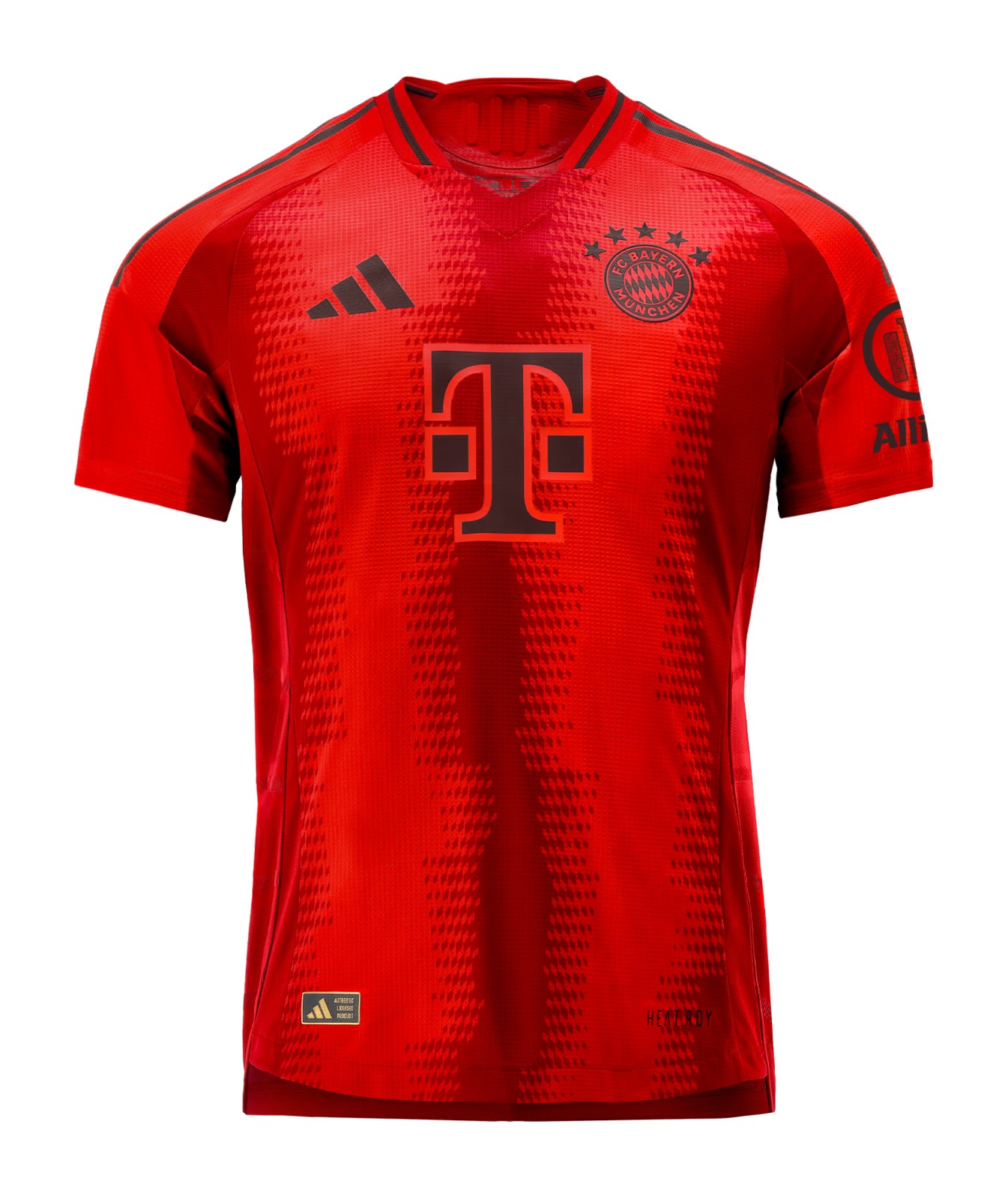
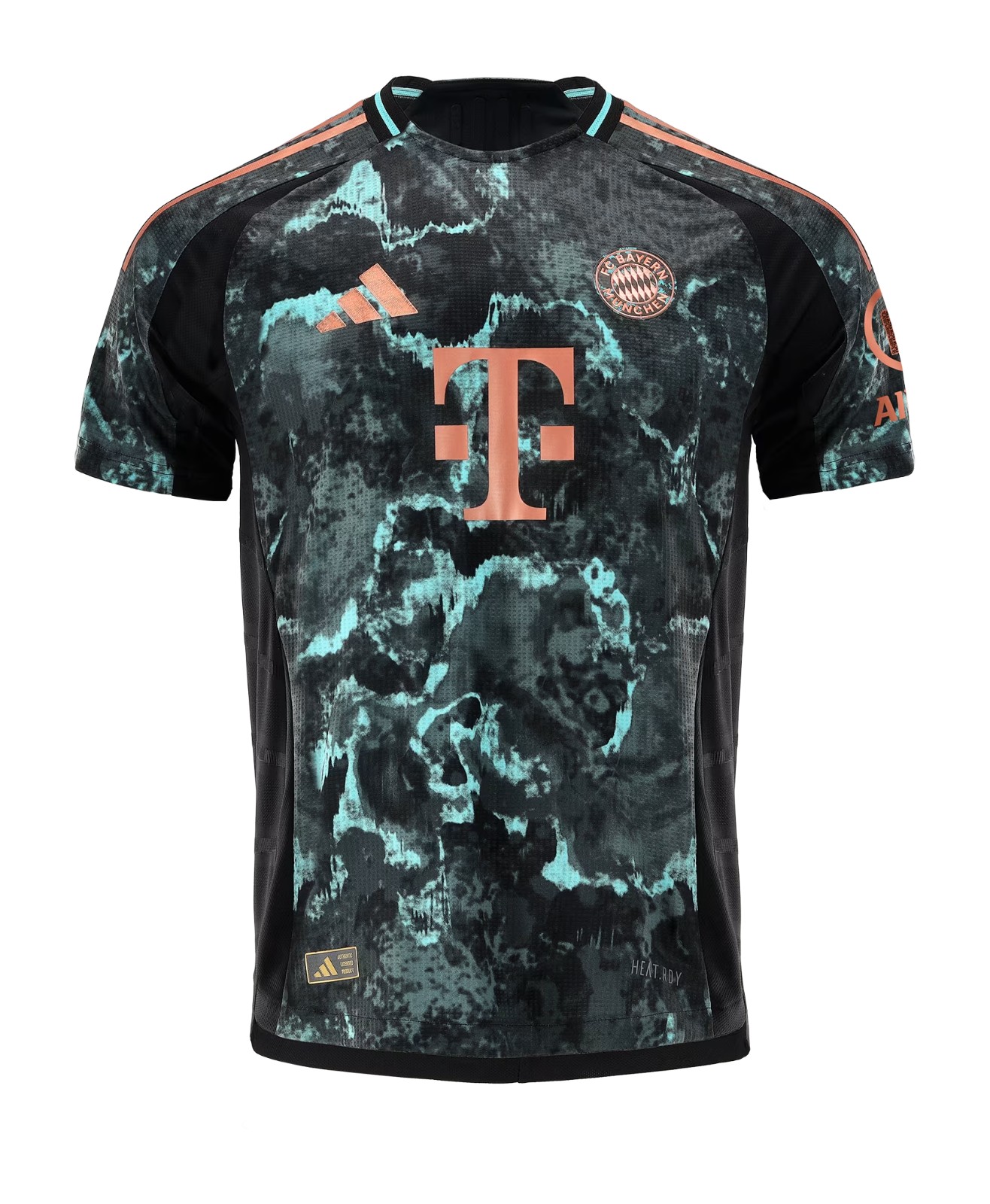
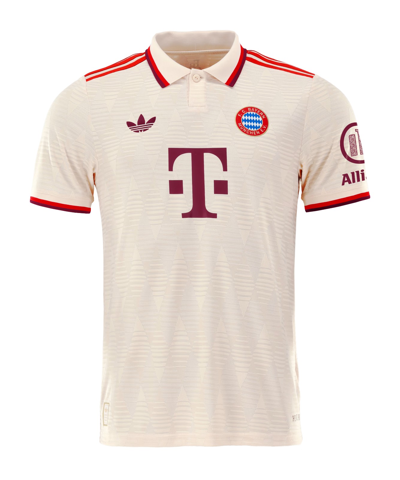
9. Bayern Munich (Adidas)
Home : After slogging through a trophyless year to forget last season, Bayern were quick to ditch their cursed white home jersey and replace it with a revamped design that could hardly be more red. There are, in fact, three shades of red, which will please all the fans who were angered by the club abandoning their iconic colour last season. However, none of that will matter if the Bavarians don't get back to winning ways while wearing it.
Away : Bayern's new away jersey is inspired by the giant statue of the spirit of Bavaria that has stood in the centre of Munich since the 19th century. In reality, that equates to a kind of mottled, crusty effect that is intended to replicate the aged patina that covers the 18-metre monument. It's not good. In fact, it's slightly unpleasant and looks like it could stand a rigorous wash.
Third : The antidote to that statue-inspired mess is one of the most handsome kits in Europe this season, Bayern's third kit is an exquisite off-white number with dual-tone red trim and a lozenge pattern woven into the material that is inspired by the 1970s-era club crest that has been applied to the chest.
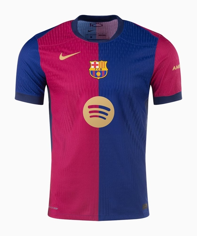
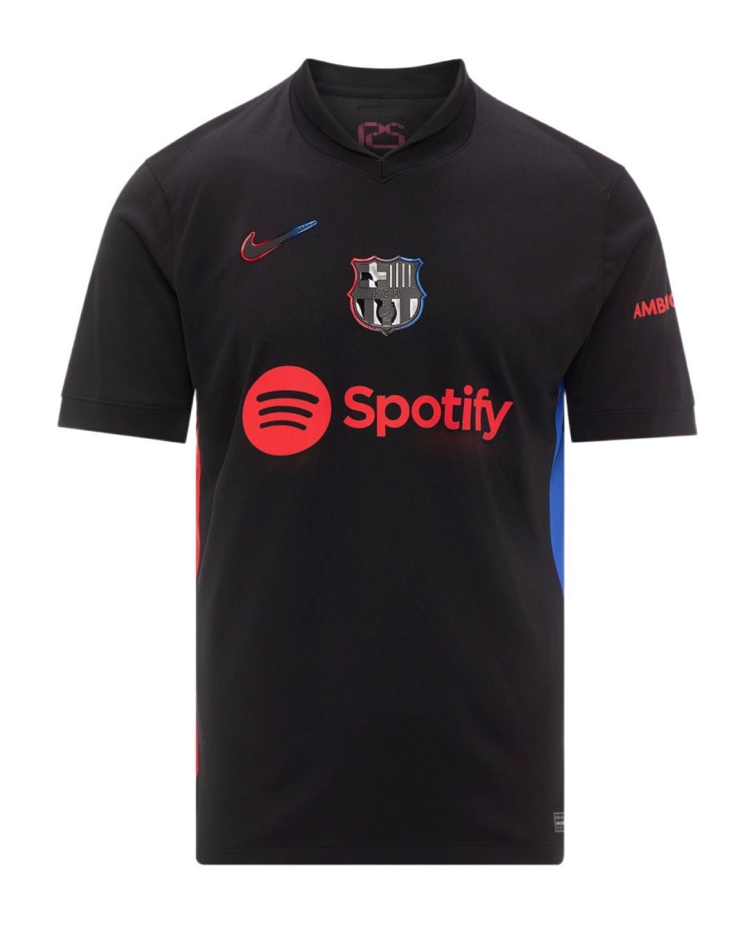
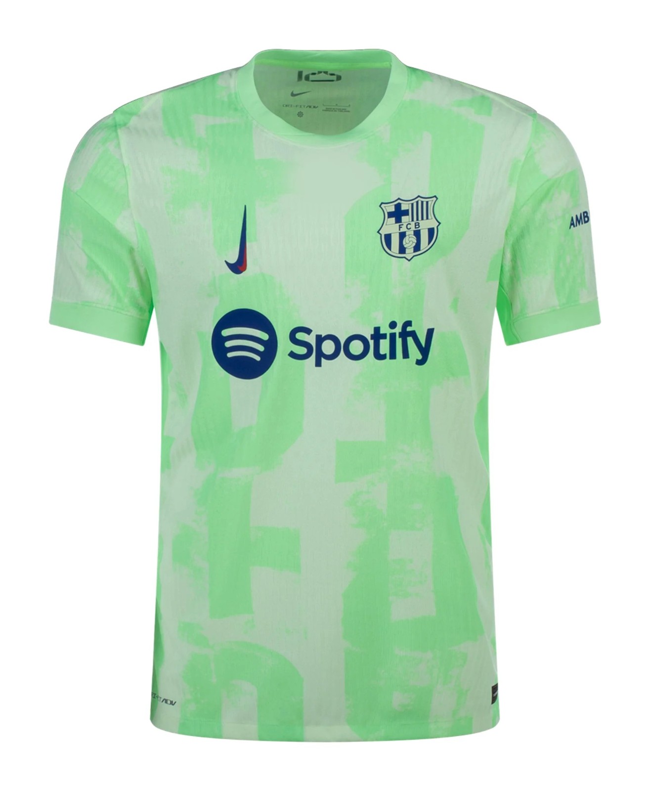
8. FC Barcelona (Nike)
Home : Barcelona are marking their 125th anniversary season with a lovely half-and-half shirt based on the one they wore when they played their first match in 1899. They then revived the design in 1999-00, the club's centenary, and again in 2008-09, when a budding young coach by the name of Pep Guardiola took his team to Spanish football's first ever LaLiga, Copa del Rey and Champions League treble.
Away : Barça have reverted to a black away kit with a sleek, stealthy design that even sees the club crest and swoosh given the ultra-noir, monochrome treatment. The blaugrana is present in the trim with asymmetrical red and blue panels added to the sides and a dual tone shimmer added to the outer edges of the various logos and badges. Extremely sharp stuff from the Catalans.
Third : The Nike Barça 2024-25 third shirt boasts a modern color scheme. It combines a light Volt with blue for logos and applications. Officially, the colors are "Barely Volt / Old Royal."
7. Atlético Madrid (Nike)
Home : Having experimented with various wave and brushstroke effects on their famous red-and-white stripes in recent years, Atlético have once again opted for a non-traditional approach for 2024-25. This season, their stripes will be bordered thin blue outlines, while pinstripes which go through the colours of the spectrums run down the middle of the white sections.
Away : A cool grey lends Atleti's away shirt an air of easy style, with the bold red-and-white trim providing the necessary highlights to lift the design above the ordinary. The textured pattern of the fabric gives the impression that the jersey is made of concrete -- fitting for a team built very much in coach Diego Simeone's rugged image.
Third : A dark blue shirt with a scribble graphic that doesn't appear to have any specific design ethos beyond looking dynamic and contemporary. The squiggles are overlaid in various lighter shades of blue and the logos are applied in lilac, along with that inverted Nike swoosh that features on all of the brand's elite team third kits this season.
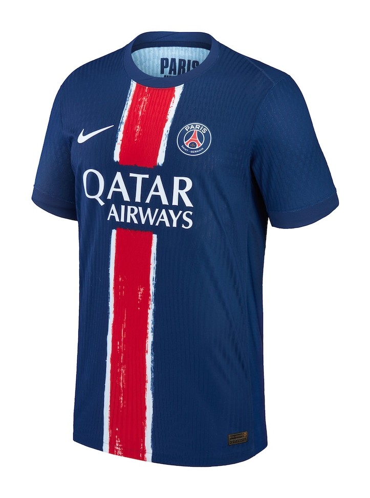
6. Paris Saint-Germain (Nike)
Home : After being bumped around the shirt, inverted and even ending up on the sleeve cuffs at one point in recent years, PSG's iconic "Hechter" stripe has been restored to its rightful place down the middle of their new home kit. A faint brushstroke effect is detectable therein but hopefully it's subtle enough to placate the club's ultras, who had previously complained about the disrespect being shown to their hallowed red-and-white stripe.
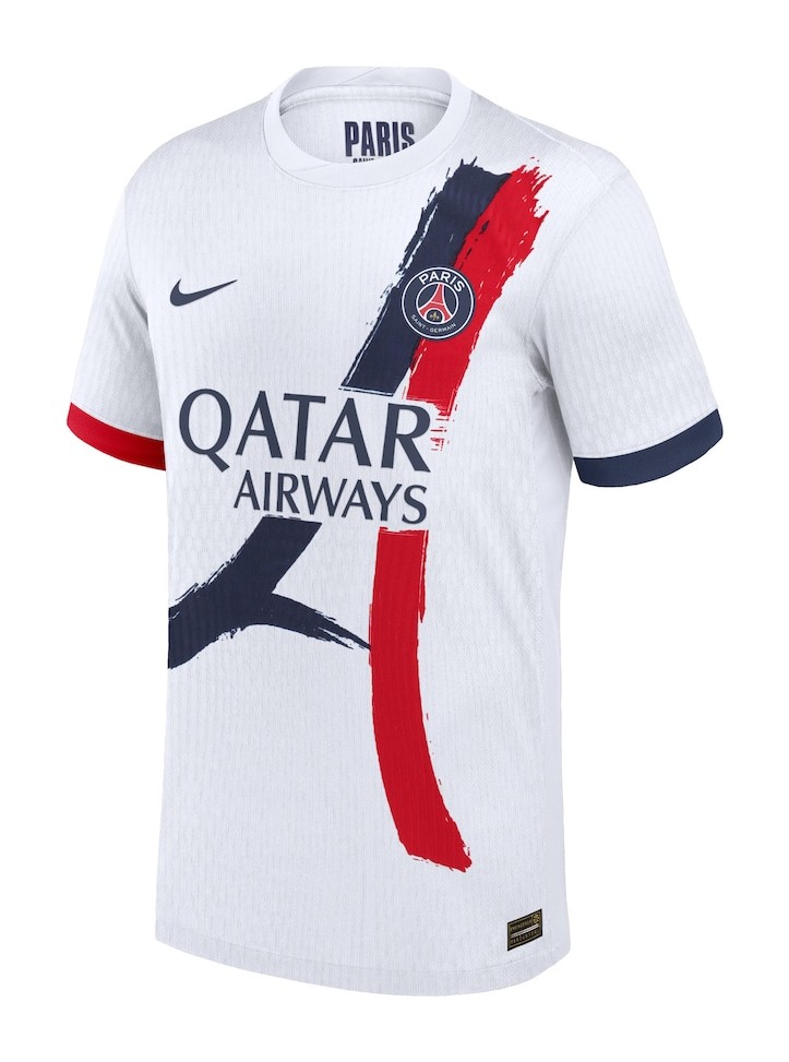
Away : Looking like it was lifted straight from an old Parisian tourist brochure, the PSG away kit is dominated by a stylised image of the Eiffel Tower. That dated aesthetic is actually deliberate as the "painting" of the iconic landmark is a throwback to a very similar graphic that appeared on two PSG kits in the early 1990s.
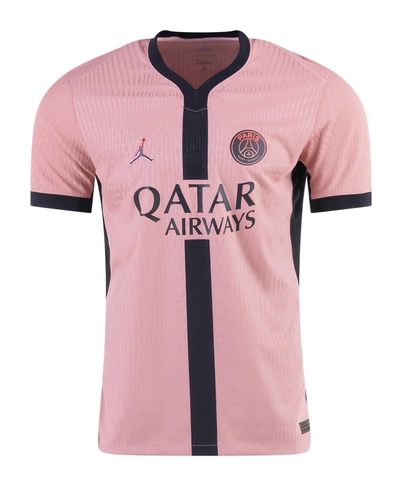
Third : The new Jordan PSG 2024-25 third football jersey is mainly 'Rust Pink' combined with black accents.
5. Bayer Leverkusen (Castore)
Home : With golden Bundesliga badges glistening on the black sleeves, Leverkusen will defend their first-ever title in a smart red kit befitting the reigning champions. While the base design is fairly straightforward, the imprint in the fabric has lots of interesting elements -- from an aerial map of the city, to the Leverkusen coat of arms, to the symbols found on the underside of the Leverkusen-Bürrig (a huge, UFO-shaped water tower that dominates the skyline.)
Away : There is even more gold on the club's new away shirt. However, the shimmering crest and manufacturer logo are actually in reference to the club's 120th anniversary celebrations, and was actually before Xabi Alonso's side sealed their historic triumph last season.
Third : Debuted in the recent friendly against Arsenal, the majority of Leverkusen's new third alternate jersey is black with contrasting white panels beneath the arms, while the logos and sponsors are applied in what effectively amounts to "toothpaste" blue. The intricate light grey graphic in the material is actually a salute to the graffiti art found on walls around the city.
4. Monaco (Kappa)
Home : Monaco are celebrating their centenary this year, so it's no surprise that they have gone for a very similar home shirt to those they have been sporting for the majority of their history. Instead of the usual thick red sash across a white background, though, the red section extends all the way up to the shoulders.
Away : The deep-green away kit uses a subtle print motif to celebrate different elements of Monaco's history on their 100th birthday. The pattern is made up of silhouettes of the unconventional architecture of their Stade Louis II stadium, details from the royal tapestries found in the throne room at the Prince's Palace and various other emblematic motifs taken from around the Principality.
Third : Monaco's ice-white third kit may look at first glance to be a plain design, but it does feature a wavy contour graphic. This is intended to evoke images of some of the Principality's contemporary architecture such as Le Stella tower, the Palais de la Plage and the Testimonio buildings. Très chic!
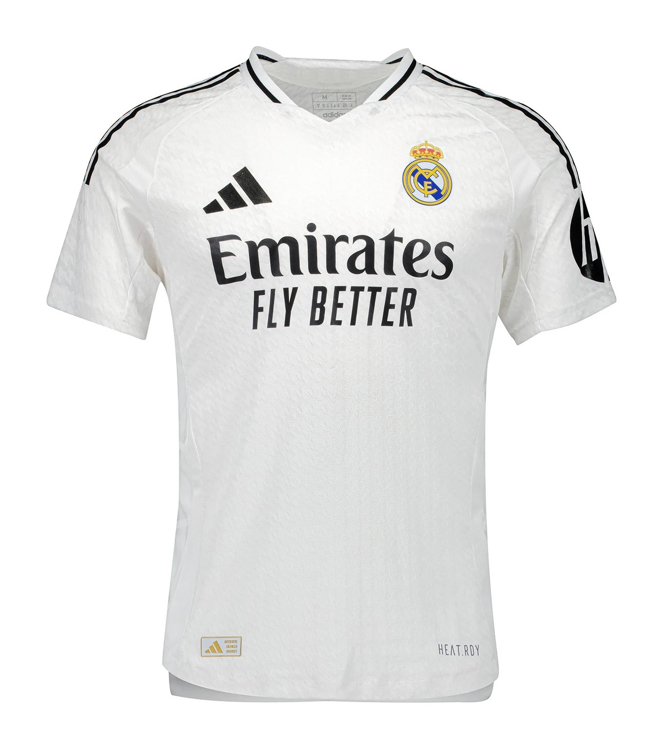
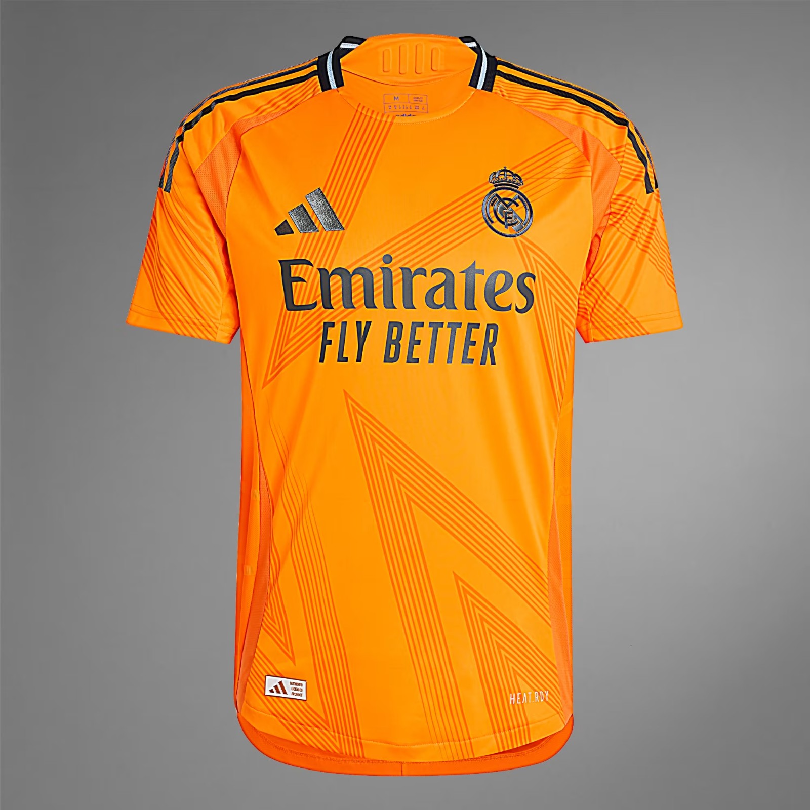
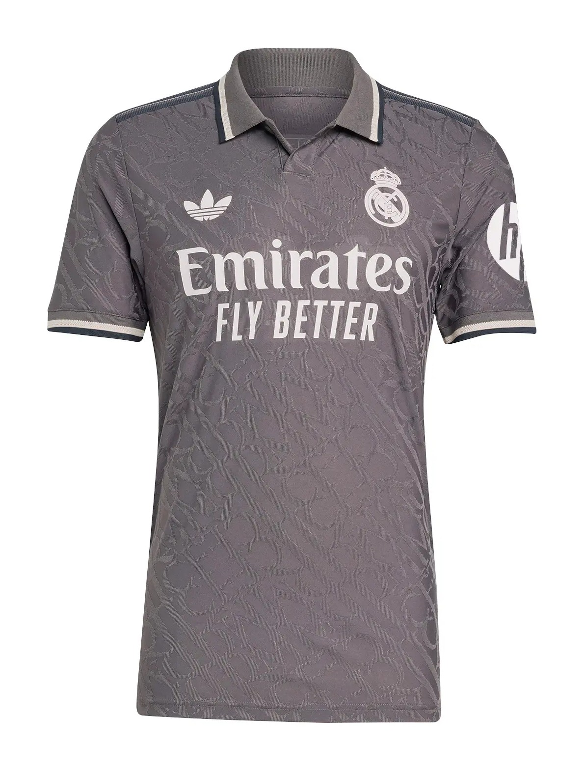
3. Real Madrid (Adidas)
Home : It won't come as much of a surprise to learn that Los Blancos have gone for a white home kit this season. They've also cycled through their mini-spectrum of approved trim colours and landed back on black for 2024-25. The houndstooth knit in the fabric is inspired by the traditional "Chulapo" jackets and waistcoats worn by the people of Madrid during the city's annual San Isidro festival.
Away : Madrid's new away jersey is a vivid shade of golden orange, similar to that worn in 2013-14 -- the season when they completed their quest for La Decima by winning a 10th European Cup/Champions League. Now, a decade on, they have 15 wins to their name. The jersey also features an angular, star-shaped graphic print which is appropriate given they have added Kylian Mbappé to their squad this summer.
Third : Part of Adidas' retro range of third alternate jerseys with the throwback "trefoil" logo, Real Madrid's version is a sleek dark grey polo shirt which is covered in a chic "RMCF" monogram akin to high-end luxury luggage.
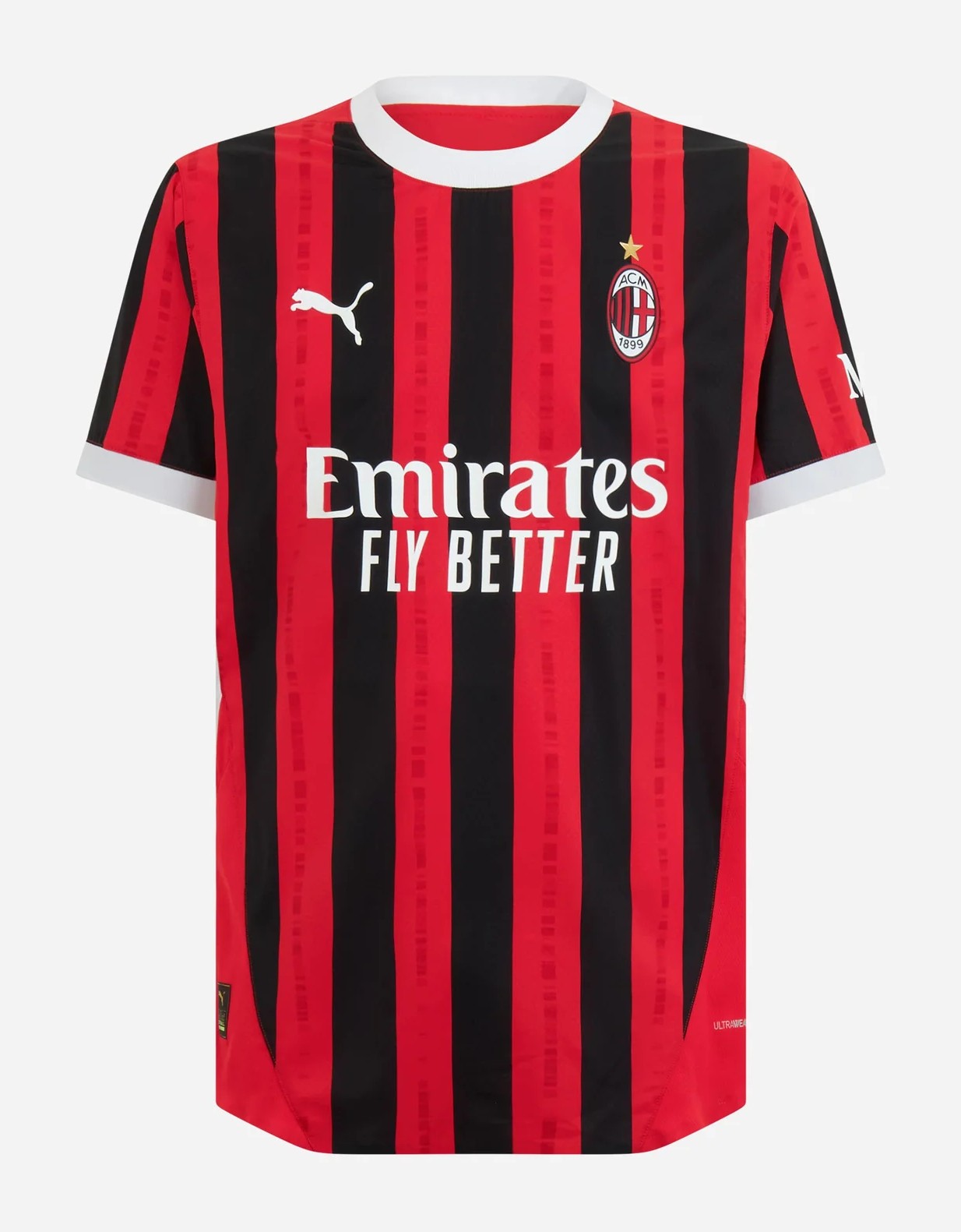
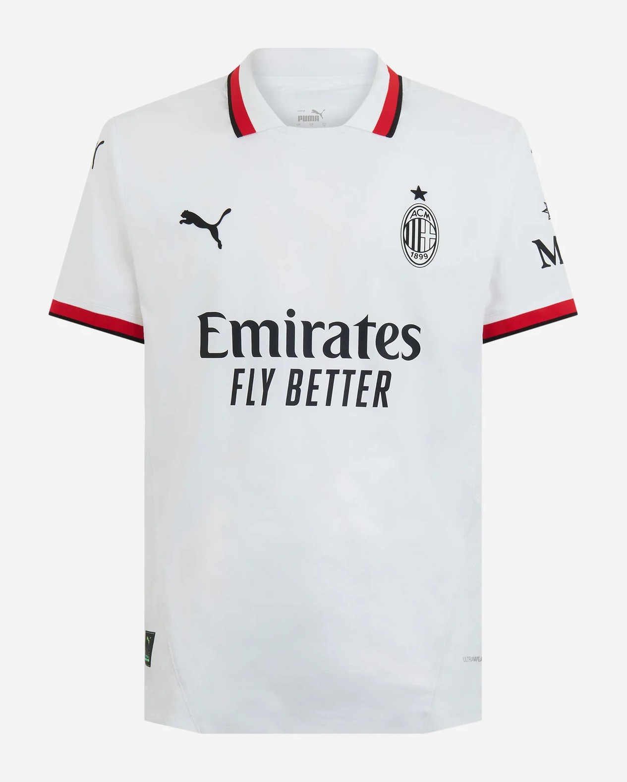
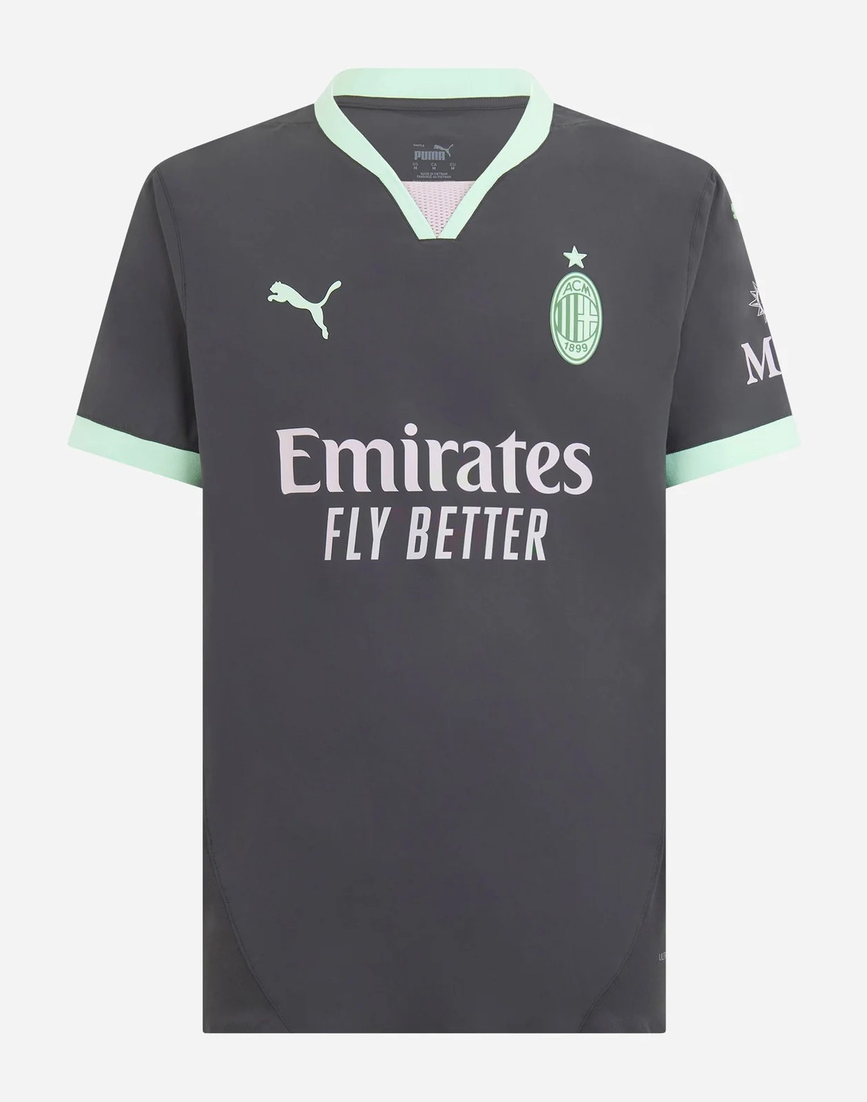
2. AC Milan (Puma)
Home : It's no coincidence that their 125th anniversary year has seen Milan ditch the experimental chevrons of 2023-24 in favour of a return to a timeless take on their beloved Rossoneri stripes. It is destined to be a winner with calcio purists and kit connoisseurs alike, which is a rare thing.
Away : Unveiled with a novel "quick change" stunt during their recent preseason friendly against Manchester City, Milan's 2024-25 away kit is a nod to the club's roots as a football and cricket club founded by English expats at the turn of the 20th century. A beautiful, crisp white shirt is light on gimmickry as a dress collar, elegant monochrome logos and a tasteful flash of red trim complete the picture.
Third : An extremely sharp third kit offering from Milan, who have paired a smoky charcoal base colour with contrasting pale minty green trim to create a jersey that will look good on the pitch, in the stands and in the streets. Molto bene.
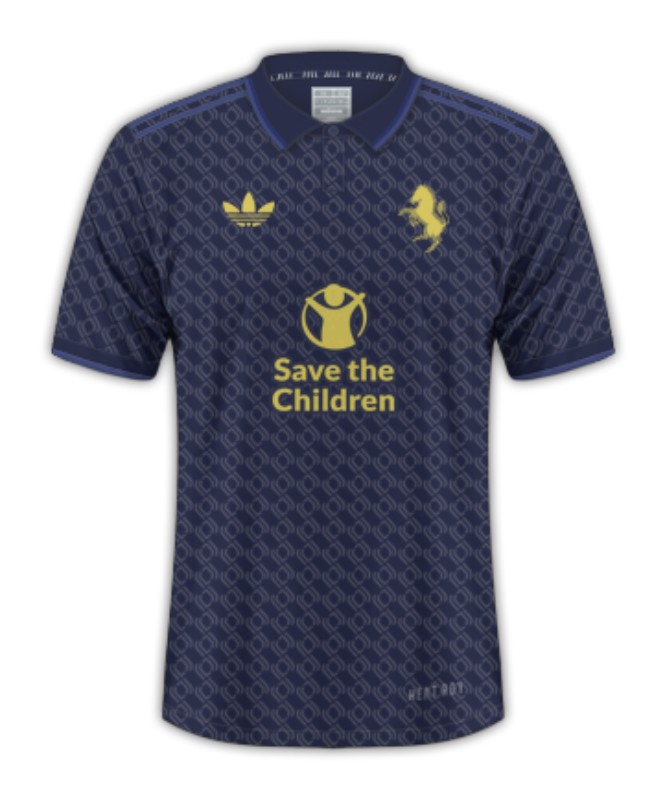
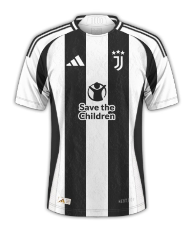
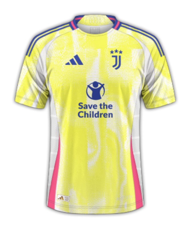
1. Juventus (Adidas)
Home : After veering off the beaten path several times in recent years with home kits daubed in animal print and weird half-and-half arrangements, Juve have kept things nice and simple for 2024-25 with a traditional striped jersey. However, just for fun, it features a craggy graphic in the fabric that is inspired by the surface of the moon. Because of course it does.
Away : The space theme continues on Juve's new away kit, which manufacturer Adidas says takes its cues from interstellar exploration and the galaxies beyond our own. This probably makes more sense from a marketing perspective than telling the truth, which is that it is clearly inspired by the packaging of a tub of off-brand margarine. Still, when it works, it works.
Third : While the third alternate is not as rigidly adhered to the astral concept as the other two -- this dusky blue jersey is meant to reflect the night sky -- but that hardly matters. The textured weave adds to the classy look of this polo shirt, while the golden silhouette of a prancing zebra -- a symbol first used on Juve uniforms in the early 1980s -- stands out beautifully.